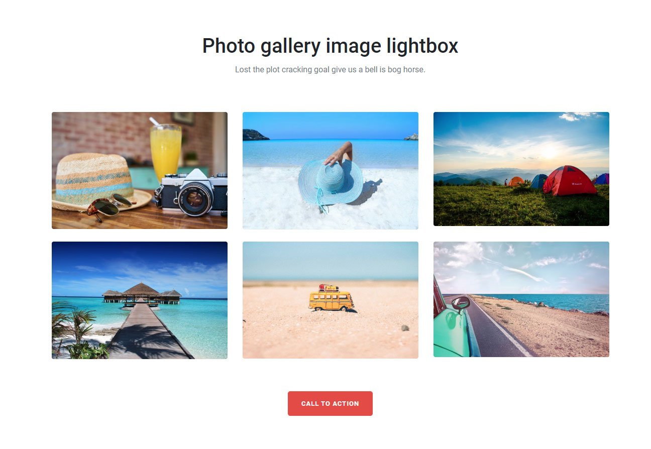
Free photo gallery with bootstrap three column grid, you can use this on middle of your web page, simple div structure easy to implement.
<!doctype html>
<html lang="en">
<head>
<!-- Required meta tags -->
<meta charset="utf-8">
<meta name="viewport" content="width=device-width, initial-scale=1, shrink-to-fit=no">

<!-- Bootstrap CSS -->
<link rel="stylesheet" href="https://stackpath.bootstrapcdn.com/bootstrap/4.5.0/css/bootstrap.min.css">
<link rel="stylesheet" href="css/light-box.css">
<title>Bootstrap photo gallery snipp</title>
<style type="text/css">
@import url('https://fonts.googleapis.com/css2?family=Roboto:wght@300;400;500;700&display=swap');
body {
    font-family: 'Roboto', sans-serif;
}
.btn {
    padding: 14px 26px;
    font-weight: 700;
    font-size: 13px;
    letter-spacing: 1px;
    text-transform: uppercase;
}
.btn-danger {
    background-color: #e34c43;
    border-color: #e34c43;
}
</style>
</head>


<body>
<div class="container py-5">
  <div class="row py-5">
    <div class="col-12 text-center">
      <h2 class="h1 pb-1">Photo gallery image lightbox</h2>
      <p class="mb-5 text-muted">Lost the plot cracking goal give us a bell is bog horse.</p>
    </div>
      <div class="col-12">

      <div class="row gallery-four">

      <div class="col-lg-4 col-md-6 mt-4">
      <a href="img/content-demo-four.jpg" data-toggle="lightbox" data-gallery="example-gallery"> <img src="img/content-demo-four.jpg" class="img-fluid rounded"> </a>
      </div>

       <div class="col-lg-4 col-md-6 mt-4">
      <a href="img/content-demo-two.jpg" data-toggle="lightbox" data-gallery="example-gallery"> <img src="img/content-demo-two.jpg" class="img-fluid rounded"> </a>
      </div>

       <div class="col-lg-4 col-md-6 mt-4">
      <a href="img/content-demo-three.jpg" data-toggle="lightbox" data-gallery="example-gallery"> <img src="img/content-demo-three.jpg" class="img-fluid rounded"> </a>
      </div>

       <div class="col-lg-4 col-md-6 mt-4">
      <a href="img/content-demo-five.jpg" data-toggle="lightbox" data-gallery="example-gallery"> <img src="img/content-demo-five.jpg" class="img-fluid rounded"> </a>
      </div>

       <div class="col-lg-4 col-md-6 mt-4">
      <a href="img/content-demo-six.jpg" data-toggle="lightbox" data-gallery="example-gallery"> <img src="img/content-demo-six.jpg" class="img-fluid rounded"> </a>
      </div>

       <div class="col-lg-4 col-md-6 mt-4">
      <a href="img/content-demo-seven.jpg" data-toggle="lightbox" data-gallery="example-gallery"> <img src="img/content-demo-seven.jpg" class="img-fluid rounded"> </a>
      </div>

       </div>

       </div>
    <div class="col-12 text-center mt-5 pt-3"> <a href="#" class="btn btn-danger btn-lg">call to action</a> </div>
  </div>
</div>

<!-- Optional JavaScript -->
<!-- jQuery first, then Popper.js, then Bootstrap JS -->
 <script src="https://code.jquery.com/jquery-3.5.1.slim.min.js" ></script>
 <script src="https://cdn.jsdelivr.net/npm/[email protected]/dist/umd/popper.min.js" ></script>
 <script src="https://stackpath.bootstrapcdn.com/bootstrap/4.5.0/js/bootstrap.min.js" ></script>
<script src="https://cdnjs.cloudflare.com/ajax/libs/ekko-lightbox/5.3.0/ekko-lightbox.js"></script>
<script>
$(document).on('click', '[data-toggle="lightbox"]', function(event) {
                event.preventDefault();
                $(this).ekkoLightbox();
            });
</script>
</body>
</html>